
%22%2F%3E%3Cstop%20offset%3D%221%22%20stop-color%3D%22hsl(61%2066%25%2044%25)%22%2F%3E%3C%2FlinearGradient%3E%3C%2Fdefs%3E%3Crect%20width%3D%2264%22%20height%3D%2264%22%20rx%3D%2232%22%20fill%3D%22url(%23g)%22%2F%3E%3Ctext%20x%3D%2232%22%20y%3D%2241%22%20text-anchor%3D%22middle%22%20font-family%3D%22ui-sans-serif%2C%20system-ui%2C%20sans-serif%22%20font-size%3D%2224%22%20font-weight%3D%22600%22%20fill%3D%22%23fff%22%3EIV%3C%2Ftext%3E%3C%2Fsvg%3E)
Landing Pages That Actually Convert
A landing page has one job. Someone arrives from an ad, a search result or a link a friend sent, and within about eight seconds decides whether to keep reading. Everything on the page either helps that decision or gets in its way.
Below: the four things every page that works seems to share, four public pages worth taking apart, and a checklist for building your own. The screenshots are real — the point is the pattern, not the logo.
What a page that works has
Not much, is the honest answer. The pages that convert best are usually the ones that removed the most. Four things survive the pruning.
1. A layout you can read at a glance
One column, one idea per screen, and a visual order that matches the order you want people to think in. If a visitor has to decide where to look, you have already spent some of your eight seconds.
Whitespace is doing more work here than any graphic. Give each section enough room that the eye knows where a thought ends. Break long stretches of text with an image or a component that demonstrates rather than describes — a short screen recording of the product doing its job beats three paragraphs about the product doing its job.
2. Copy that says the thing
Write the sentence a customer would use to describe you to a colleague, and put it at the top. Then support it with specifics: what it does, who it is for, what it costs.
Cut the adjectives. “Powerful”, “seamless” and “innovative” are noise — every competitor claims them, so they carry no information. Numbers, constraints and named outcomes carry information. “Set up in an afternoon, no engineer required” tells a reader something; “streamlined onboarding” does not.
Short sentences. Short paragraphs. Read the page aloud and delete every clause you stumble on.
3. Visuals that show the product
The single most persuasive thing on a software landing page is a picture of the software. Not an abstract illustration of teamwork — the actual interface, with real-looking data in it.
Use motion sparingly and only where it explains something: a two-second loop of the thing being used, not a decorative parallax. Whatever you use, compress it properly and give it explicit dimensions so the layout does not jump while it loads. A page that reflows under the reader’s thumb undoes a lot of good design.
4. One obvious next step
Decide the single action you want and make everything else quieter than it. Label it with a verb and an outcome: “Start a free trial”, “Book a demo”, “See pricing”. Repeat it at the natural pauses in the page rather than once at the very bottom.
If there is a reason to act now — a trial that starts today, a cohort that fills, a price that changes — say it plainly. Manufactured urgency is transparent and costs you more trust than it gains you clicks.
Four pages worth studying
Linear
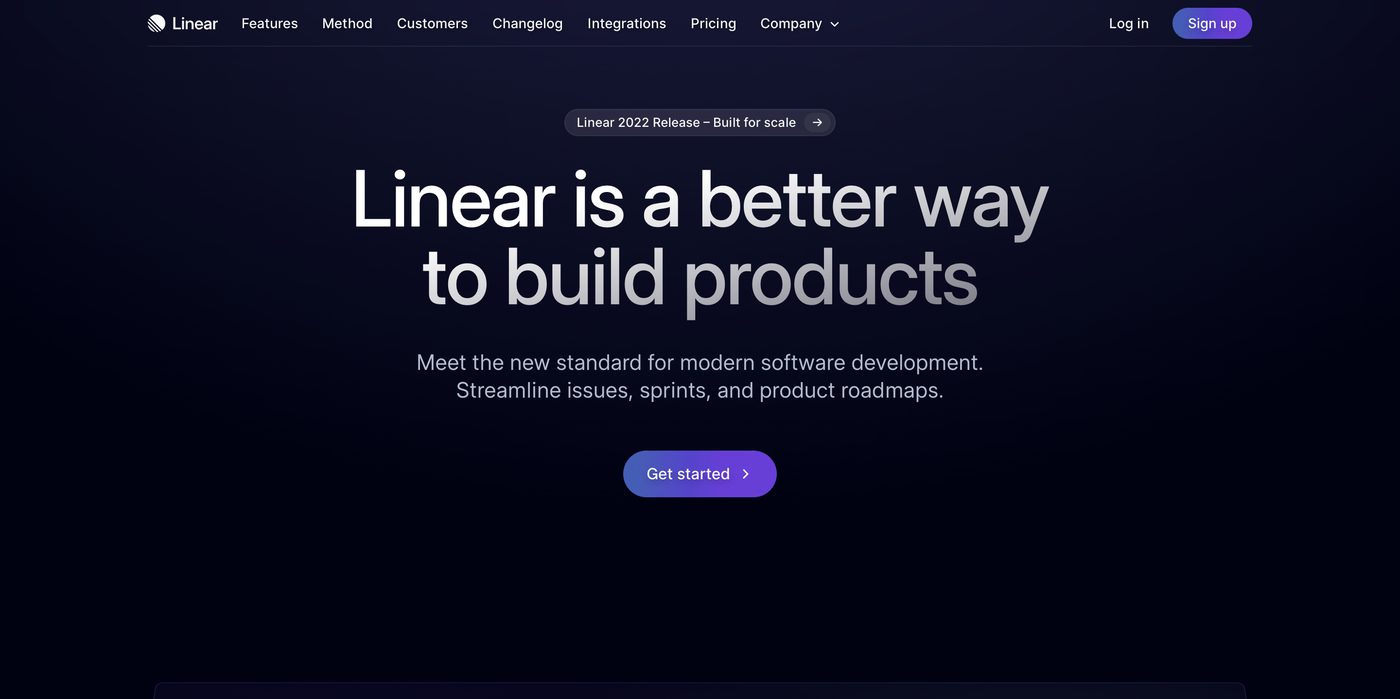
Linear is a project tracker for product teams. Its landing page opens with the tool itself, populated and mid-cycle, before it explains anything. You understand the product before you have read a sentence.
It converts because the page trusts the product. The interface is the hero image, the copy stays short, and every claim on the page is something the screenshot next to it is already proving.
Algochurn
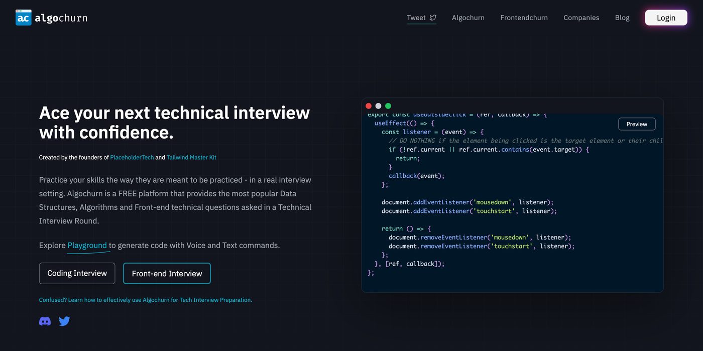
Algochurn helps engineers rehearse technical interviews. The page is almost aggressively plain: a headline, a live exercise you can attempt without an account, and a single button.
Letting a visitor use the product before signing up is the whole trick. By the time you hit the account wall, you have already had the experience the page was trying to sell you.
Stripe
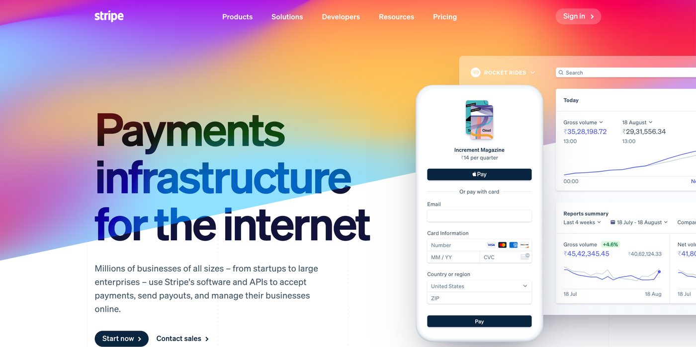
Stripe sells payment infrastructure, which is a category where trust does all the work. The page leans into it: the numbers up front, plainly worded copy, and documentation one click from the hero with a test card in your hand a couple of minutes later.
Note what it does not do. No stock photography, no vague talk about being a partner in your growth. The tone is the product — careful, specific, faintly boring, exactly what you want from something that touches money.
Railway
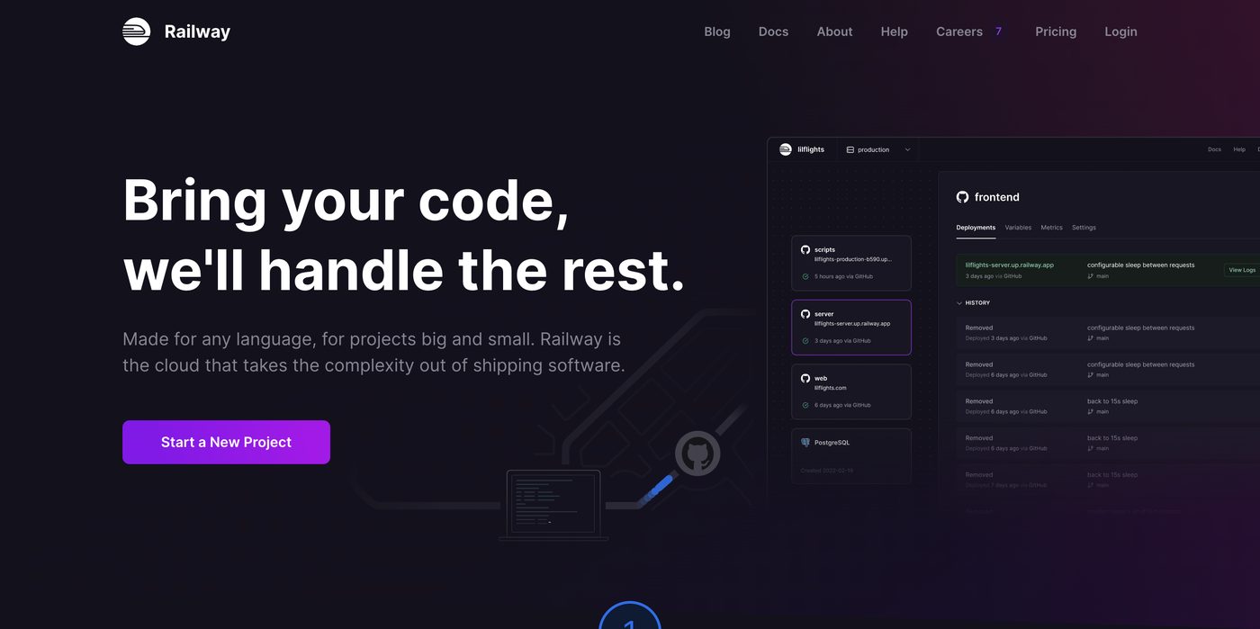
Railway is a deployment platform, and its page is built around a single promise: your project is live in minutes. The hero shows a deploy happening instead of a paragraph describing one.
Underneath, the page answers the objections in order — what it costs at scale, how you leave, what happens when it breaks — with a short honest answer each. Handling the objections on the page instead of in a sales call is what makes it work.
Building your own
A short list to work through before you publish.
- Write the page before you design it. If the argument does not hold up in a plain text document, no layout will save it.
- Lead with the one sentence. Test it on someone outside your industry. If they cannot repeat it back, rewrite it.
- Show the product early. A real screenshot in the first screenful, sized and compressed properly.
- Keep one call to action. Same wording every time it appears. If a section is not moving someone toward it, cut the section.
- Design the small screen first. Most of your traffic is holding a phone. If it works there, widening it is easy.
- Set a performance budget and hold it. Everything you add has to earn its kilobytes.
- Instrument it before launch. Page views, scroll depth and conversions from day one, or week one tells you nothing.
- Then change one thing at a time. Headline, hero image, button copy, in that order of impact. Give each change enough traffic to mean something.
In short
Landing pages that work are not clever. They say one true thing clearly, show the product doing its job, deal with the obvious objections, and ask for one action.
Write it, ship it, measure it, then improve the weakest section. That loop beats a redesign nearly every time, and it costs a fraction as much.